Palette bench
Color stories that stay clear at a distance
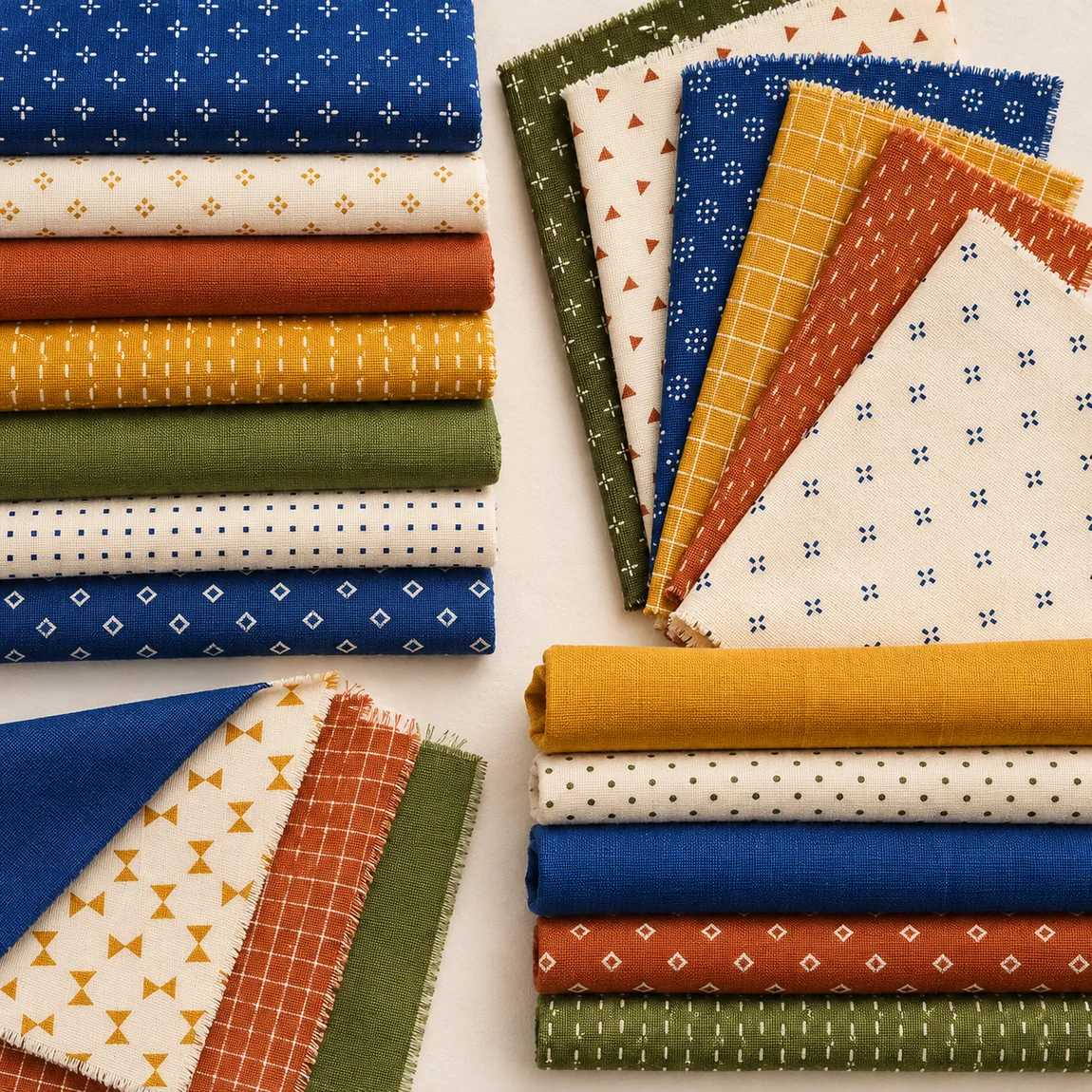
Palettes fail when every fabric competes. Build from one anchor hue, one contrast, and a neutral that lets the eye land — then test in grayscale to confirm value does the work.
Value first
Squint at the stack: if shapes disappear, add a lighter light or a darker dark. Prints hide value — audition solids beside them before you commit yardage.
Warm & cool conversation
Indigo and sage cool a quilt; rust and butter warm it. Pair cousins across temperature for sophistication — navy against persimmon, olive against honey.
Resting neutrals
Cream is not absence — it is the page. Unbleached cotton, oatmeal, and soft gray let saturated blocks breathe. Use negative borders in the same family so the center feels deliberate.